Strathmore

Overview
Strathmore is a vibrant, welcoming, multidisciplinary arts center and presenter in Maryland, just outside of Washington, DC.
Although their in-person experience was warm and friendly, their site experience was lacking, dated, and not mobile-friendly. Their CMS limited their capabilities of presenting and cross-promoting content in an engaging way.
Strathmore needed a new site that better captured the spirit of their organization while providing an easily navigable experience across devices. They wanted to increase engagement with an emphasis on mobile. Because Strathmore is a non-profit organization that depends on patron funding, they also needed an improved membership page.
My Role
I served as the project’s lead designer. Based on discovery findings and discussions with the Strathmore team, I created all the designs and prototypes needed to capture key functionality and updated their information architecture. I also conducted usability tests to help improve and inform the design of their membership page.
Discovery
The project began by conducting a series of workshops with the Strathmore team to help understand their organizational goals, user goals, and vision for their new website. The following key users and goals were identified.
Ticket Buyer Goals
Find an event easily
Buy tickets
Plan my visit
Accessibility
Member Goals
Compare membership level benefits
See the impact of my gift
Enjoy member benefits
Community Member Goals
Access and find free events
Access to community events

Data
A review of their google analytics showed that mobile was by far the most popular device category, yet the data indicated that the experience on mobile was lacking. Mobile sessions had the highest bounce rate and lowest pages/session.
The membership page was one of the core pages that Strathmore was interested in addressing. This page was experiencing low engagement and extremely high bounce rates.
Bounce rate on mobile: 66.52%
Pages visited per session: 1.94
Membership page mobile bounce rate: 71.43%
Membership page desktop bounce rate: 60%
Information Architecture
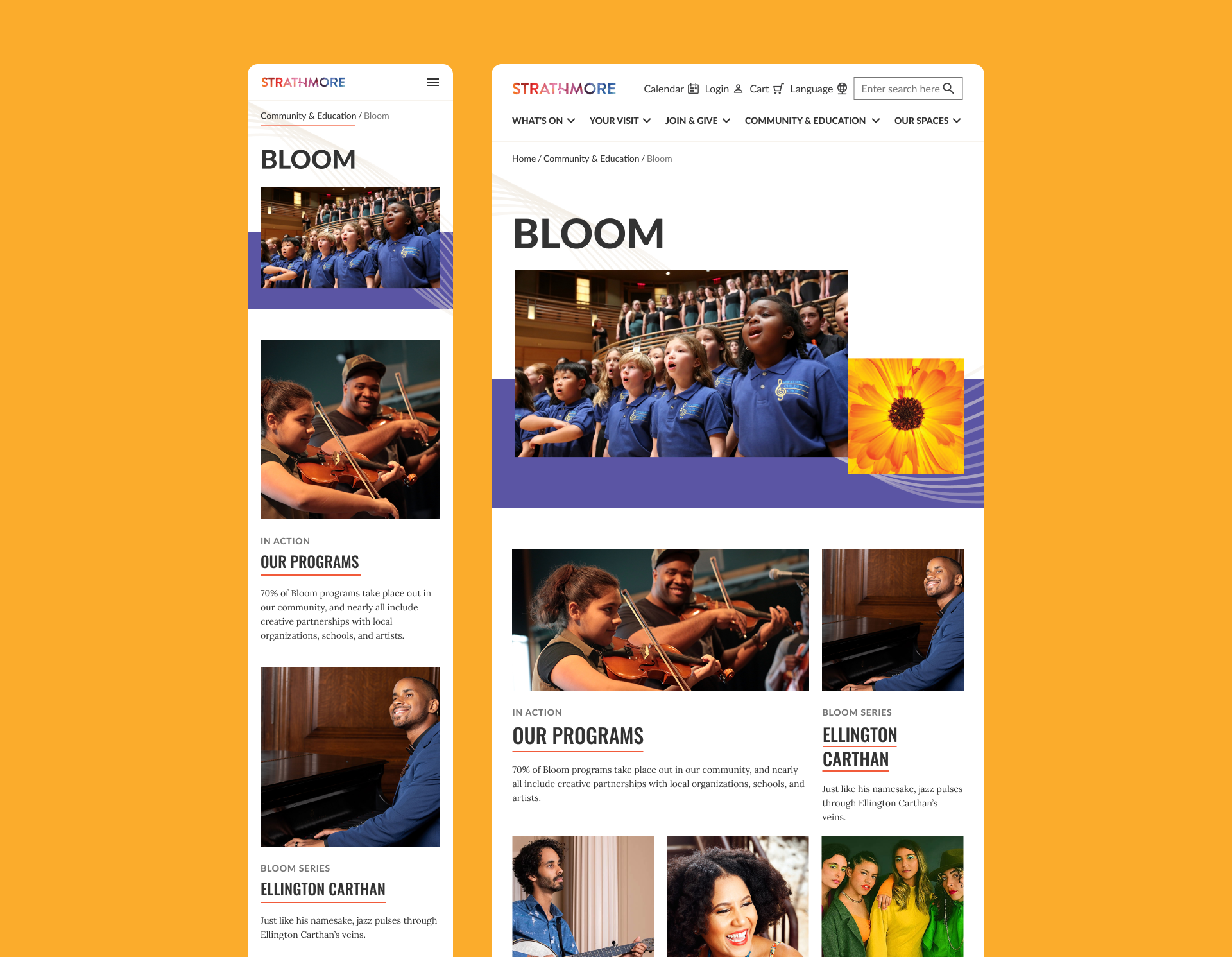
Based on user discovery findings conducted at the beginning of the project, I updated the information architecture of the site so that it was focused on key users and their goals.

Design
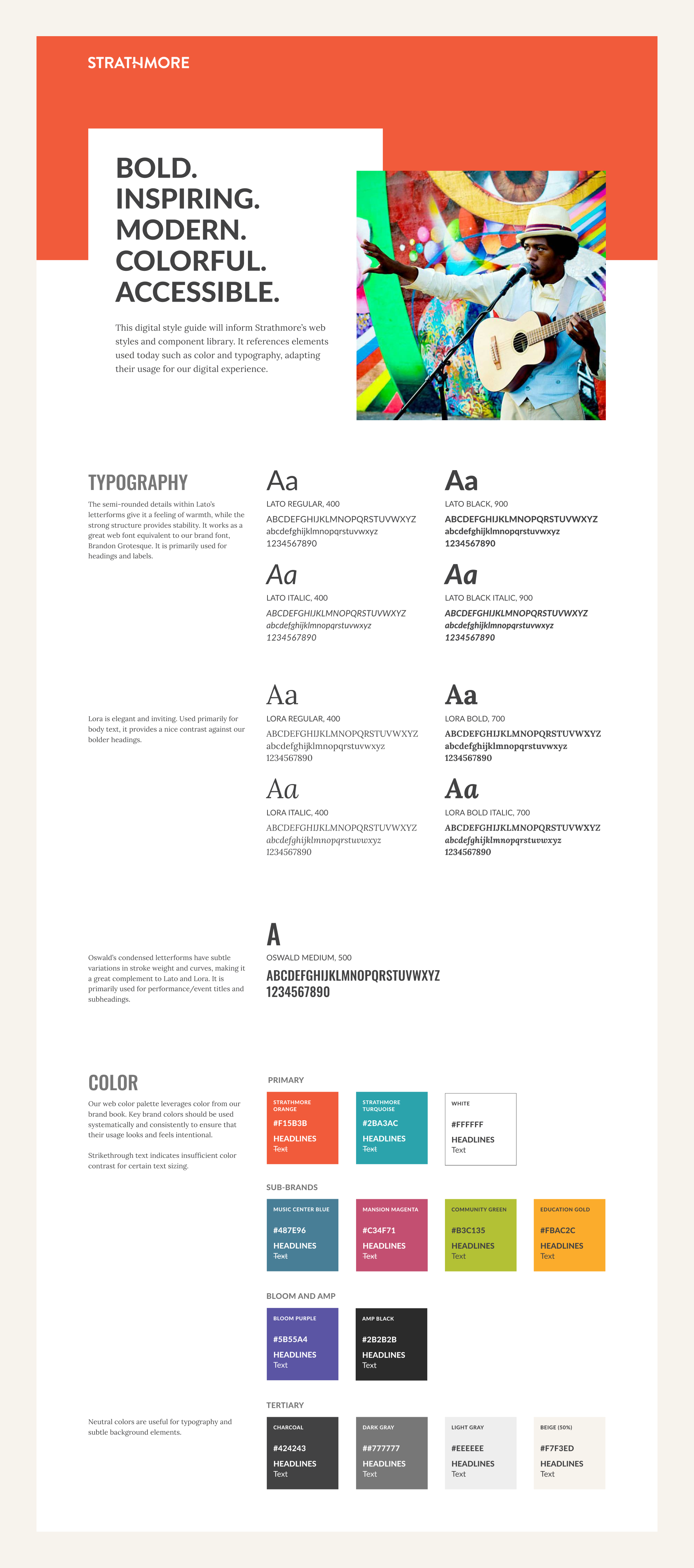
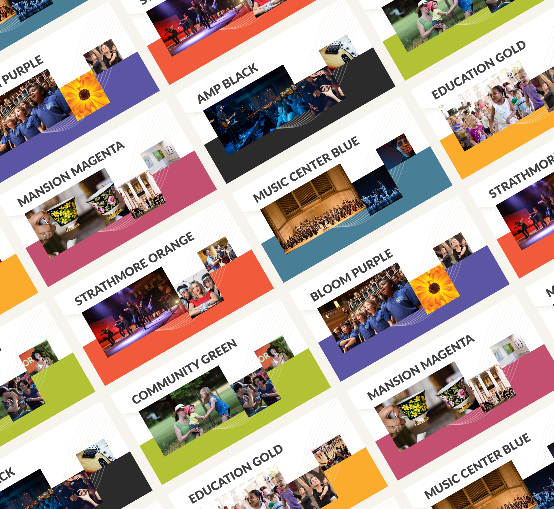
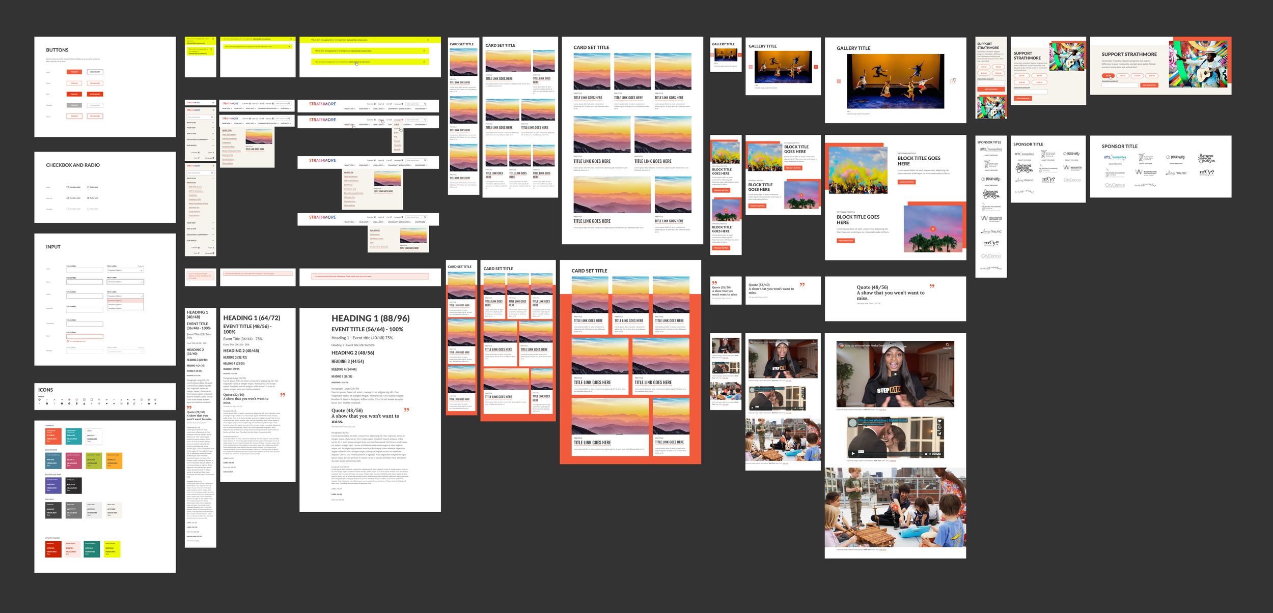
When tackling the UI design, I first started by defining the foundational styles to help inform the broader system. Their design system needed to be as vibrant and multi-faceted as Strathmore. I was mindful of color and text combinations, making sure information was legible. Once foundational elements were defined, I was able to show how components could be combined and configured to address specific content needs. I also leveraged the color palette for theming specific areas and content of the site.

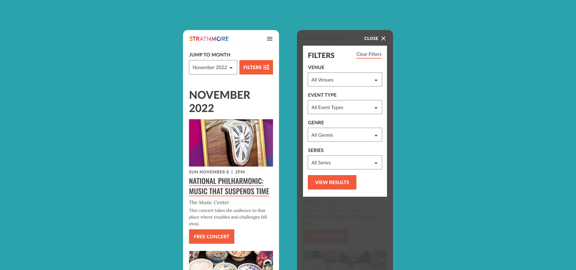
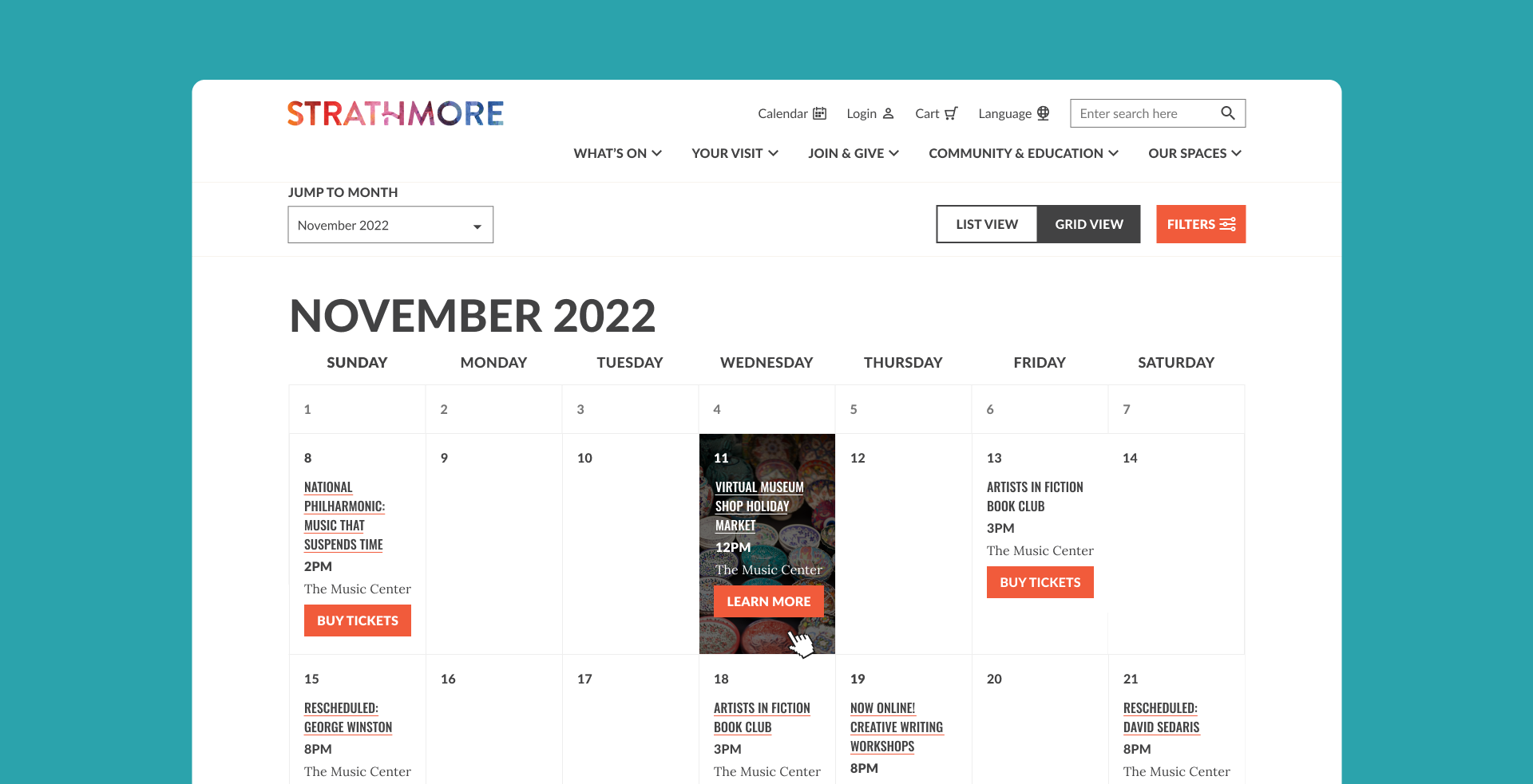
Calendar
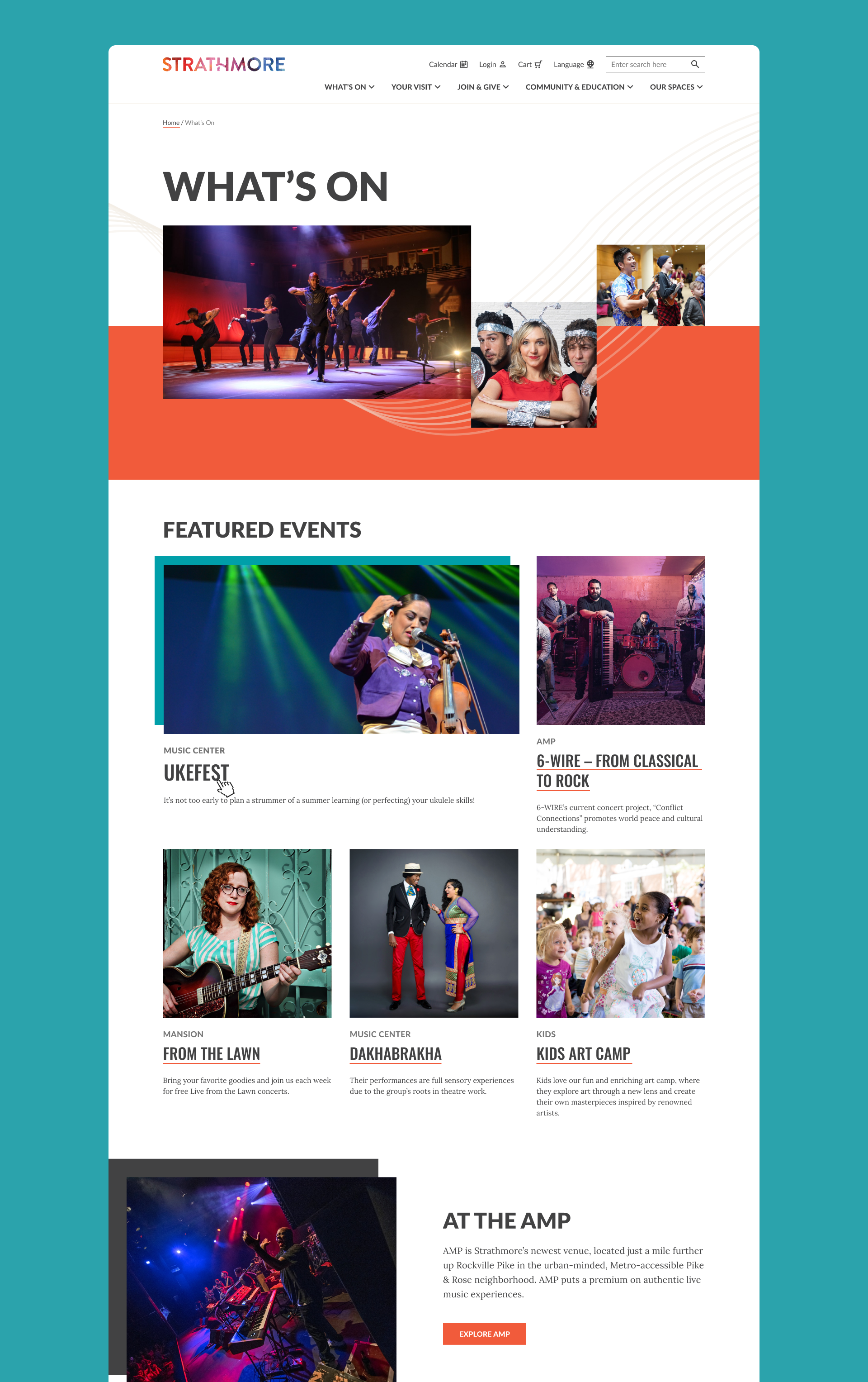
I designed a new responsive calendar for Strathmore that allows visitors to browse different event types and filter down to offerings that pique their interest. Filters such as “Venue” and “Event Type” help users who want to attend an event in a specific space or users who are looking for free community events. On desktop, users have the ability to toggle between a calendar grid and a list view. The grid view is particularly helpful for visitors who are trying to plan for a specific day of the week.
Usability Testing
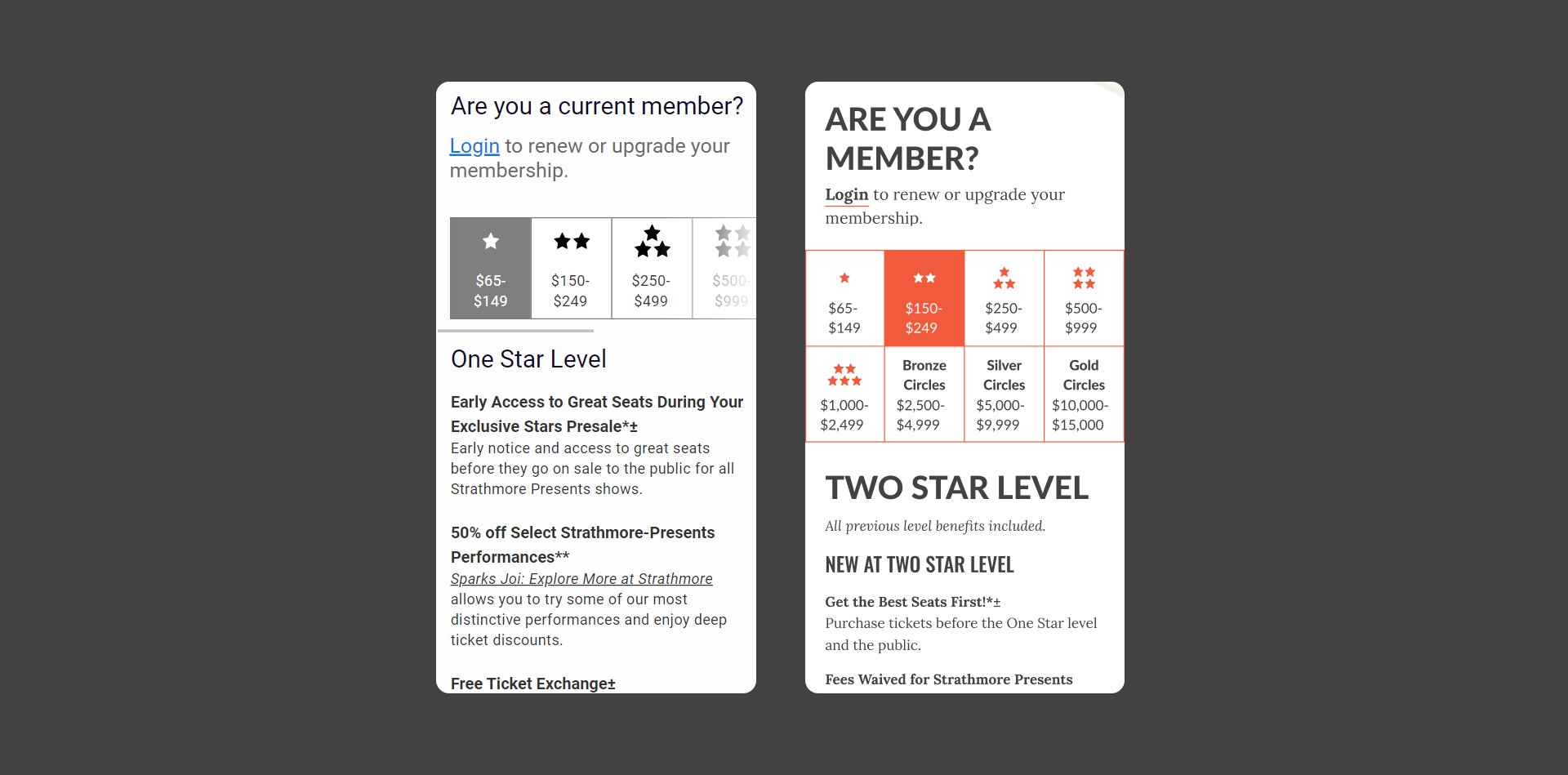
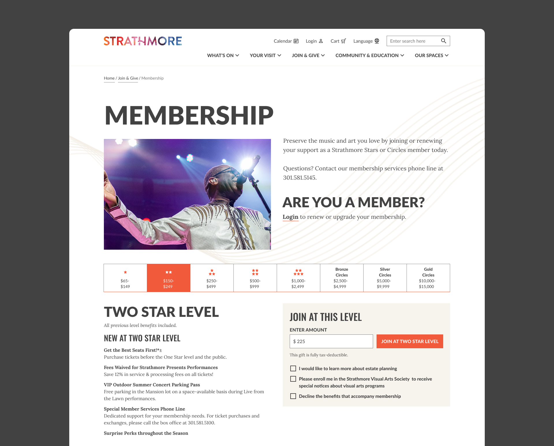
I produced responsive low-fidelity membership page prototypes based on Strathmore’s membership rules and goals. I conducted 5 remote usability testing sessions using these prototypes and created a script of prompts that aligned with membership page goals.
Based on findings from the testing, I was able to make informed adjustments to the final responsive design of the page.
Functionality Feedback from Testing:
Users found click/tab/tap functionality for comparing benefits easy to navigate on mobile and desktop.
Participants noted the paragraph above the level comparison buried important information and wanted to "get to the meat of it" sooner.
Some users mentioned that they liked that they could see previous level benefits beneath the new benefits.
The "Upgrade to X Level" area was noticed, but users still appeared to mainly focus on comparison via tabbing from level to level.
Everyone noticed the login messaging for current members. They also easily detected the login link within this messaging on the page. They understood that they had to log in to upgrade, renew, or see their current membership level.
Mobile users did not immediately realize that they could horizontally scroll to see higher membership levels.
Results
A year after the new site's launch, analytics showed the following improvements:
Mobile bounce rate decreased from 66.52% to 3.41%
Mobile pages per session increased from 1.94 to 4.42
Membership mobile page bounce rate decreased from 71.43% to 3.29%
Membership desktop page bounce decreased from 60.00% to 0.52%
